The Psychology of Color in Marketing
As primates, humans have large, complex brains and forward-facing eyes that allow depth-perception. While most animals use sense of smell as their dominant sensory system, primates heavily rely on visual activity. Humans use these visual cues for basic adaptive behavior such as getting dressed, cleaning, avoiding danger, making friends, and even shopping. Due to these visual cues, color plays a huge role in daily lives, especially when it comes to influencing purchases. As a digital marketing agency, Bright Age knows that color plays a major role in brand identity and marketing. Purchase intent is often affected by color. Consumers use color as a way to determine the “personality” of a brand. Because of this, it is important to choose the appropriate colors for a specific brand. But how do you know what colors fit a brand’s personality? This is where color psychology comes into play.
Color psychology is the study of how colors affect perceptions and behaviors. When used in marketing, color psychology focuses on how certain colors impact a consumer’s impression of a brand. When making purchases many consumers have admitted that they focus primarily on visual appearance, with color being the main draw of their focus. So how do different colors influence people?
Red:
Red is a high-energy color that immediately pulls focus. It is associated with movement, excitement, or passion, and it creates a sense of energy. As a physical stimulator to the human body, it can affect nerve impulses and heart rate. Red is also commonly used by fast-food chains due to its appetite-encouraging abilities.
Blue:
Blue provides a sense of security and trust, young people often associate it with maturity. While blue calms the mind and provides a space of tranquility, it can also curb appetite and stimulate productivity. Blue is the most commonly used color among offices and corporate brands.
Green:
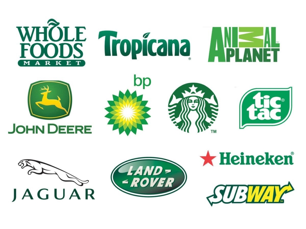
Green stimulates harmony in the brain. It encourages a balance of emotions and can lead to decisiveness. Associated with health, tranquility, and nature, green is often used for promoting environmental issues. Green is also associated with wealth and highly successful brands.
Purple:
Although the color is no longer only available to kings and queens, purple is still associated with royalty and respect. It represents creative, wise, and imaginative brands and products. Purple stimulates the problem-solving and creative parts of the brain. This color is frequently used for beauty products.
Orange & Yellow:
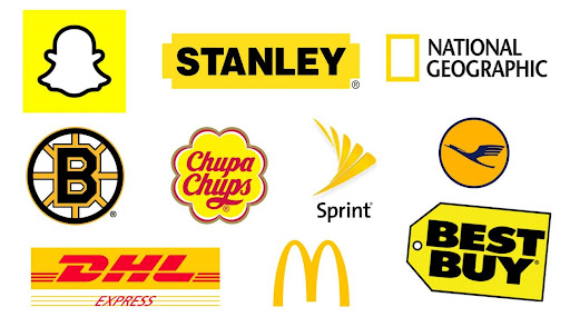
These colors stimulate logic and promote enthusiasm, but if used too frequently they can create a sense of anxiety. Yellow makes babies cry, while orange can show caution. These colors are often used as a way to draw in impulsive buyers and window shoppers.
Black:
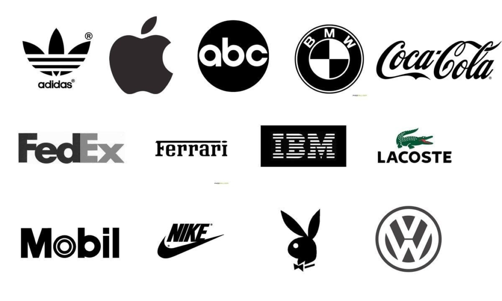
Black is associated with authority, power, stability, and strength, but when overused black can become overwhelming. Black is often used as a symbol for intelligence and to trim down the appearance of sizes on items.
Gray:
Gray can symbolize feelings of practicality, timelessness, and solidarity, although too much gray can lead to feelings of nothingness. While gray is nice to include, using gray as the main color can draw emotions of old age, depression, and even death.
White:
Using white can spark a sense of creativity, it is associated with feelings of purity and cleanliness. White is often used to project neutrality and the absence of color.
The use of color in marketing should always be tuned to the brand’s needs. Smart branding utilizes the psychological effects of color while accounting for different cultural associations. Color is an important tool that impacts the success of identity branding and marketing. As a digital marketing agency, Bright Age uses specific colors to create graphics that not only fit brands’ needs but also elevate the overall feel of these brands. For more information about the services Bright Age offers visit the link https://brightage.com/our-services/.

